
ElaWell
While this particular project started with the goal of creating a series of labels, we will focus on the journey of the logo. I knew Christine, I didn’t need a deep briefing to learn her aesthetic. We had talked for hours about her dream project and what certain symbols might mean to her. However, there are so many ways to express the same thing that you can get completely lost.

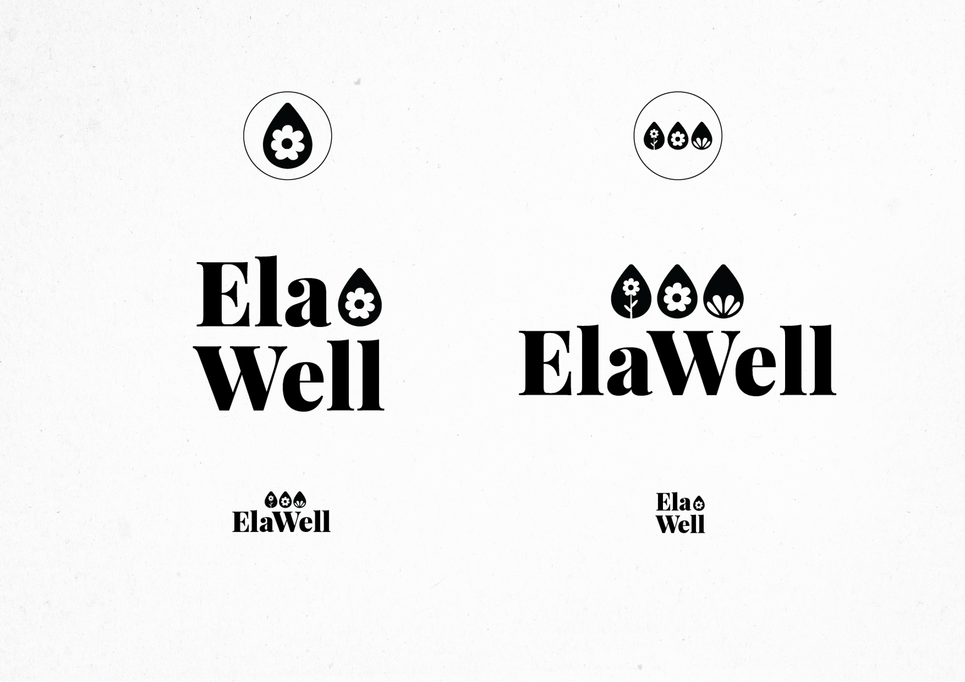
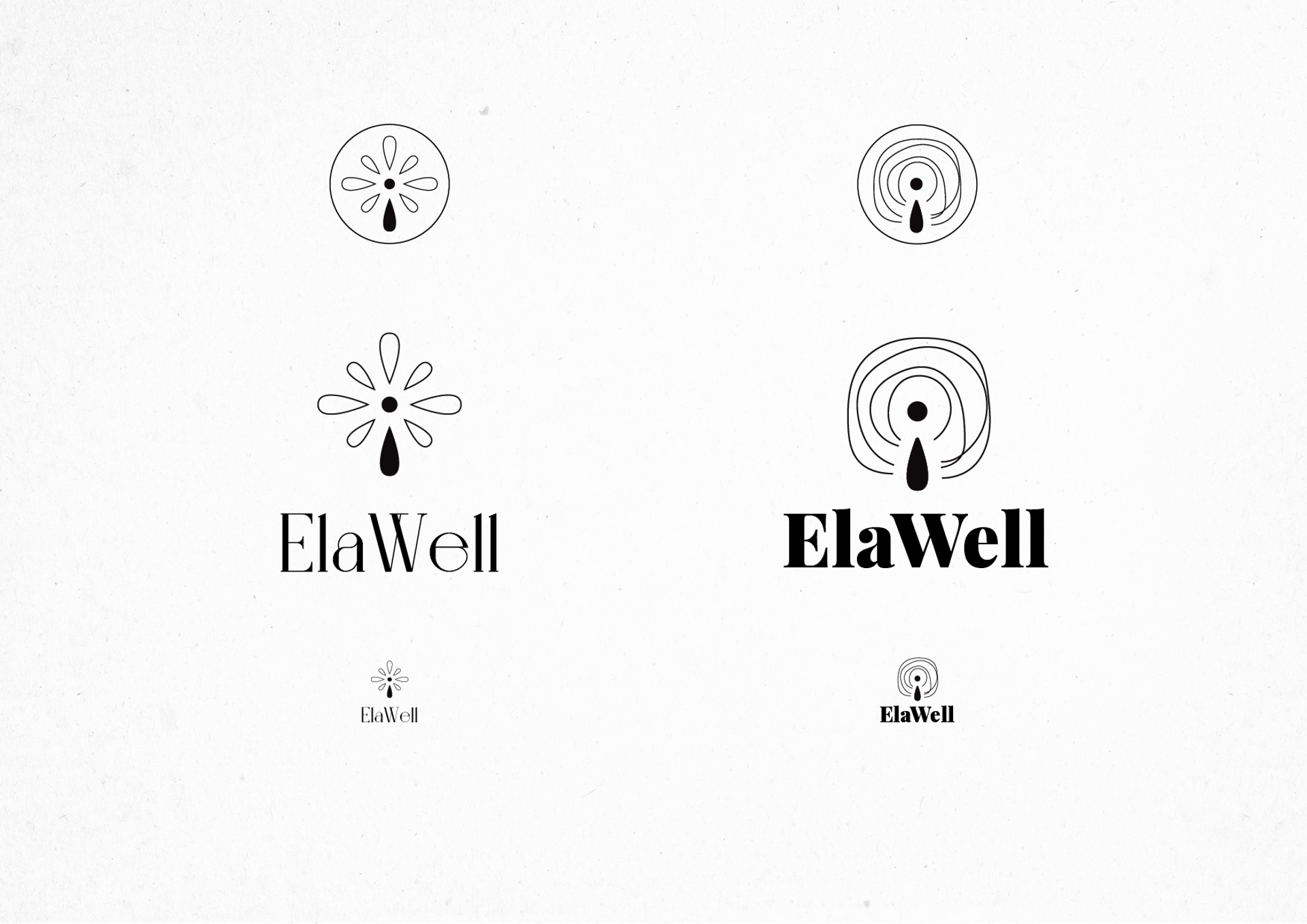
Design phase
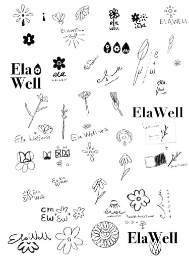
Knowing Christine, I knew she would appreciate this piece of paper more than any presentation. The process of finding hidden meanings in the designs I prepared for her excited her as much as me! Being completely honest by the time I showed her this sheet I had loved and felt empathy on every single design. Thankfully this wasn't my choice to be made.
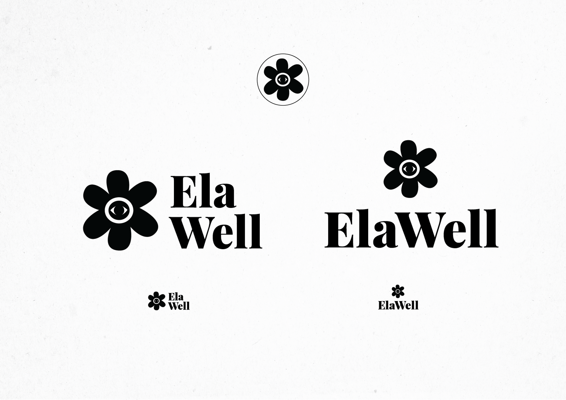
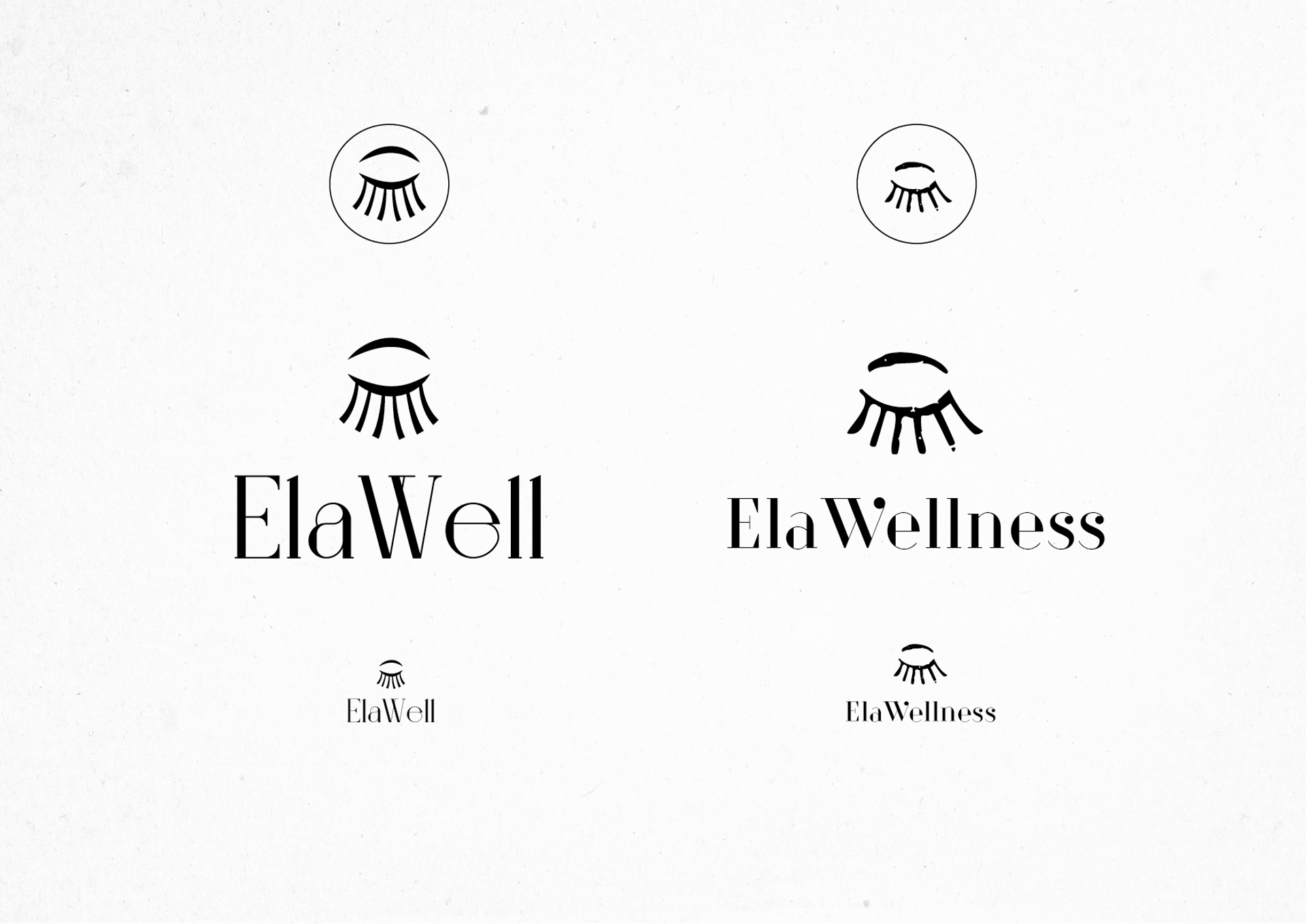
When she decided which ones she liked, we proceeded on choosing fonts and final designs. You may have already seen the result, but below I have for you a small presentation of the rest of the logos that had made it to the final stage.

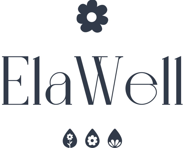
Meanings
The logo describes two different concepts that are equally important. The upper flower is created by the letters C+M+E+W which stand for Christine M. + ElaWell. The lower designs show us that in every petal lives a flower as in every flower a petal. In every action or decision we make we will find a piece of ourselves and in the same way all we are is this sum up of decisions and actions that defined us!
Truly a wonderful journey. I am going to design a logo for a rocket made of sharks because my emotional intelligence has peaked. Thank you for reading!


